 |
| Forward Research is a full service strategic
research group targeting unique markets. They specialize in health care, pharmaceutical, companion animal and agricultural industries. |

|
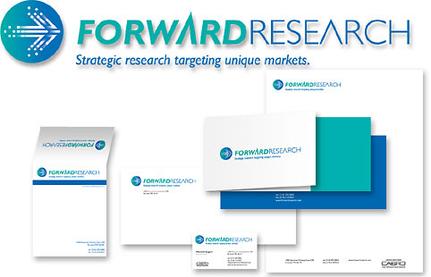
Challenge Forward Research needed to update their corporate brand image, marketing tools and web site. Although they had experienced rapid growth their marketing tools and business image suffered from a lack of professionalism, which was out-of-step with their Fortune 500 clientele. |
Solutions We created a new interpretation of their old brand mark, which consisted of arrows. This updated brand retained the familiar symbol the firm had used for many years. We also retained their color scheme of blue and green while bringing a more active forward-looking design to the company. A system was developed for using the brand effectively on stationery, PowerPoint and an all-new web site. |


