 |
| Belden CDT Inc. is one of the largest U.S.-based manufacturers of high-speed electronic cables and focuses on products for the specialty electronics and data networking markets, including connectivity. |

|
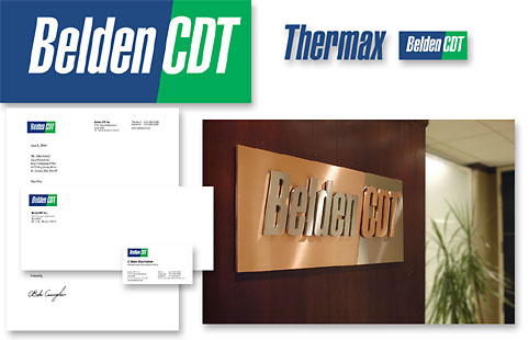
Challenge Belden CDT Inc. (NYSE:BDC), formed in July 2004 through the merger of Belden Inc. and Cable Design Technologies Corp., needed a new corporate identity. There was great equity in both names and the Belden brand was highly recognized. The challenge was to preserve this equity while communicating a new corporate entity going forward. |
Solutions The solution for the brand mark was to retain the components that were most recognizable. Using white letters in a solid shape strengthened the existing corporate colors of blue and green. The type style was retained but we slanted it forward to give it movement. The CDT companies had always used a slanted slash mark in their previous naming structure so we incorporated a diagonal color-break between the two names. When combined, the blue and green corporate brand unified the company names into one. We developed branding system for divisional companies that required emphasis of their brand while linking it to the new Belden CDT brand. Graphic standards were developed for their operations around the world that included guidelines for everything from stationery to signage. |


