

 |
The Client Sherwood-Davis & Geck was formed late in 1995 when the Sherwood Medical Company merged with Davis & Geck and the Quinton dialysis catheter business. This new company, a medical device manufacturer, serves the global healthcare industry with more than 5,000 surgical, critical care and continuing care products. The Assignment As a result of the merger, the company adopted a new corporate brand signature, and more important, updated its marketing strategy to accommodate an industry trend toward single-source purchasing. Wehrman & Company's assignment was to develop a marketing communications program to launch this new business strategy and extend the company's new corporate brand identity into every application. The merger offered a unique opportunity to reduce confusion of brand ownership, as earlier acquisitions had resulted in dozens of brands with dissimilar literature, advertising and packaging. Wehrman & Company's challenge was to bring a "one voice" brand consistency to all corporate, marketing and advertising efforts. Our assignment:
* Trademark of Sherwood Medical Company |
 |
The Issues Corporate branding After the company acquired a new corporate logo and interim standards manual, Wehrman & Company's objective was to accurately position Sherwood-Davis & Geck to customers and employees, while addressing these needs and issues:
|
 |
Merger Communications – Communicating the New Business Strategy Cost containment and consolidation trends in the healthcare market were driving a single source approach to purchasing in the medical device industry. Sherwood-Davis & Geck adopted a streamlined new business strategy to meet this emerging marketplace need. This program was called the Single Point AdvantageTM. Launching this program required a strategic marketing program that included:
The SingleVoice Marketing® Solution: Our SingleVoice solution for Sherwood-Davis & Geck included: Corporate Identity Materials
Marketing Materials
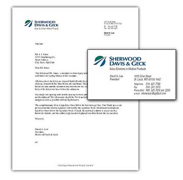
Corporate Identity Materials Branding System |
|
A branding system was created to link the the Sherwood-Davis & Geck corporate brand mark with individual brand names and various corporate programs. It was designed to be flexible so that it could emphasize different messages, depending on its use. The system was designed with many features:
Corporate Branding Ads |
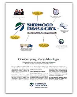 |
To announce the new company after the merger, we created two ads aimed at management-level decision makers in the healthcare industry. A corporate ad explained the new Sherwood-Davis & Geck corporate brand mark, with illustrated call outs that described the advantages of the new company. This ad "ONE COMPANY, MANY ADVANTAGES" showed the benefits of a single-source provider in combination with the new business strategy. |
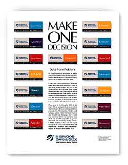 |
A second ad was positioned to emphasize the large family of brands, unified under one name. The headline "MAKE ONE DECISION" reinforced the message that Sherwood-Davis & Geck was the preferred supplier in making single source purchasing arrangements. Marketing Communications Standards Manual |
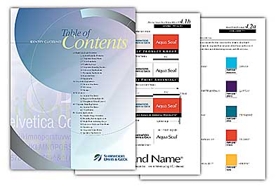 |
To ensure consistency, we developed a marketing communications standards manual which described how to use the new corporate brand mark and the branding system and provided guidelines for producing literature, marketing materials, packaging and more. Simple guidelines directed users to:
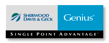
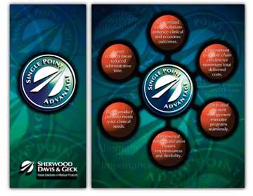
Marketing Campaign Materials Single Point Advantage™ Marketing Logo |
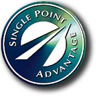 |
The Single Point Advantage™ marketing logo was created to remind customers of the advantages of working with Sherwood-Davis & Geck. It was designed as a seal to identify and unify program materials, ads, brochures and trade show graphics. This marketing logo also served to draw attention to the new corporate brand mark. Single Point Advantage Ads An ad campaign was generated to announce and define the new business strategy to customers. |
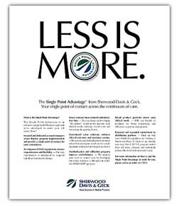 |
The headline "LESS IS MORE" drew attention to the new streamlined business structure that included a unique field organization, focused customer contact and enhanced responsiveness to customer needs. Marketing Communications Materials Wehrman & Company developed an overview brochure, folder and data sheets which described the new business strategy in detail. |
 |
The marketing literature system included:
The Results SingleVoice Marketing helped put a structure in place to successfully communicate the new corporate identity, the unification of brands and the new business strategy. The Corporate Identity Standards Manual provided a consistent, easy-to-use set of guidelines for implementing the new identity. The Branding System brought together all of the firm's product brands under the corporate umbrella of Sherwood-Davis & Geck in an organized way, presenting a consistent image to customers.The corporate ads introduced the new identity and explained the value of a new single source company to customers. The marketing of the new business strategy to customers and employees was unified under the "Single Point Advantage" campaign. A marketing brand logo was created and used to visually link brochures, ads and programs. All together, this program helped Sherwood-Davis & Geck go forward with a clear, coordinated program designed to build brand strength through repetition of of a single message in every exposure – from business cards, brochures and advertising to end – product packaging. |

