 |
| CooperSurgical, Inc. is a fast growing 100+ million dollar division of the Cooper Companies, Inc. The business consists entirely of manufacturing and marketing products to obstetricians and gynecologists. |

|
Challenge During the nearly 15-year history, the Company has grown mainly by acquiring companies or specific products from leaders in various procedural niches within obstetrics and gynecology. This growth created a confusing array of brand names and a need to clarify the value of the CooperSurgical name. Product literature, web site and other marketing tools were not consistent and projected a confusing array of brand images. |
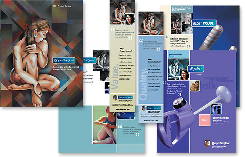
Solutions We began by updating the existing CooperSurgical brand by making minor design adjustments and created a system for identifying all of the product brands. The corporate brand and product brands were linked within a shape to provide more consistency and visibility on marketing applications. Then, a system was created to integrate all of the many product brands into a similar look and feel. A fine art painting of a woman (that has become synonymous with the Company name over many years) unifies all of the parts. A literature system was developed to bring consistency and structure to their array of brands. And, we created a system for using the legacy brand logos in a way that preserved the equity in existing names while bringing corporate consistency to all of their marketing exposures. Graphic standards were developed to provide guidelines for everything from stationery to web site to adding new brands in the future. |


