 |
| The Materials Technology Institute (MTI) is a unique, not-for-profit technology development organization representing private industry. MTI provides leadership in materials technology for chemical processing to improve reliability, profitability, and safety. |

|
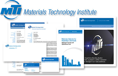
Challenge This organization of engineers wanted to upgrade its business image to better reflect the value they provide to member companies. Their old logo, marketing tools and web site were not effectively communicating the professionalism and messages required to attract new members. |
Solutions We began by updating the organization’s brand mark and graphic standards. The initials MTI had always identified the organization so we wanted to preserve this equity while giving the letters a clean, professional new look. Their old brand was also circular so we kept that element but brought a feeling of motion to it. “Maximizing resources through a global network of materials specialists” is the brand message we helped MTI implement in all communications. Since most of their work is exchanged via the web, we designed templates for stationery, white papers, PowerPoint and other documents to maintain a consistent brand image. And, we designed a new web site for MTI that includes a secure members’ area for exchanging information and collaborating on various research projects. |


